
UNPLUGGD | Look Up. Live More.
A digital-wellness concept designed to make healthier screen habits feel less restrictive and more intentional.
- Challenge
- IFP 50 Hour Design Challenge | Season 15 | UI Design
- Team
- Solo Designer
- Date
- September 2025
- Recognition
- Silver Winner
- Type
- Design Challenge Concept
Project overview
Unpluggd was created as a solo project for the IFP 50 Hour Design Challenge, Season 15.
The brief explored a familiar tension: technology is essential to everyday life, but constant checking, scrolling, and digital interruptions can make it difficult to stay intentional about how that time is spent.
Instead of designing another product around hard limits and forced disconnection, Unpluggd takes a gentler approach. The concept combines screen adjustments, usage awareness, focus tools, and mindful nudges to help people notice their habits and make more deliberate choices.
The challenge
Technology is useful. Autopilot use is the problem.
Digital-wellness tools often rely on limits, warnings, and hard blocks. Those interventions can make people more aware of screen time, but they can also turn the experience into a repeated cycle of restriction and dismissal.

How might a digital-wellness experience encourage more intentional screen use without making technology itself feel like the enemy?
The product idea
Use technology better, not less.
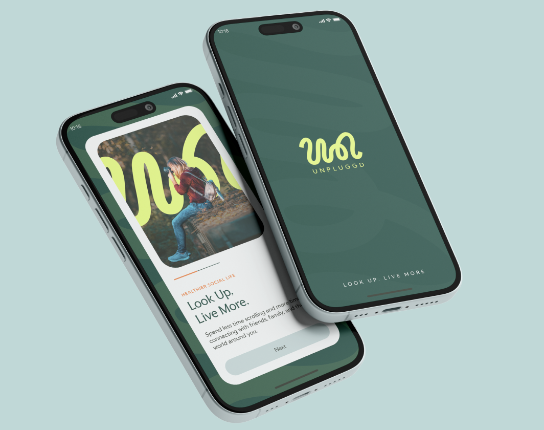
Unpluggd is built around the idea that digital wellness does not have to mean quitting technology. Instead, the product introduces small moments of awareness during everyday use, helping users recognise when a session is becoming automatic and giving them an opportunity to pause or continue intentionally.
Awareness before restriction
Surface behaviour before trying to stop it.
Gentle friction
Use subtle interface changes rather than aggressive interruption.
Clear feedback
Translate usage patterns into information that is easy to understand.
User choice
Keep the final decision with the user.
Experience flow
From onboarding to everyday awareness.
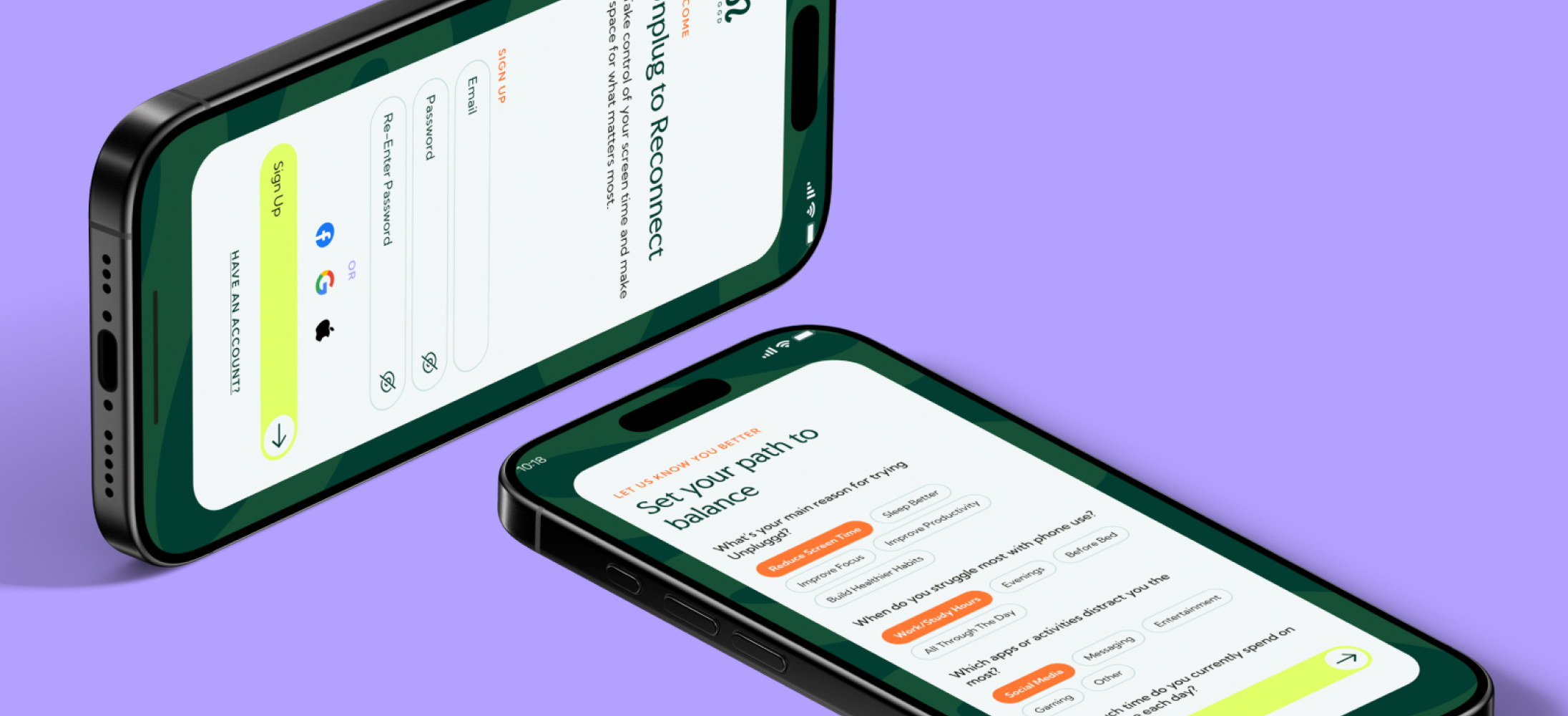
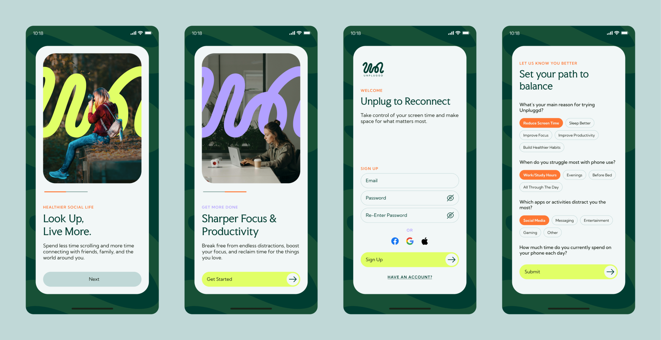
The product asks about goals and usage patterns during setup so the later experience can be framed around what the user is trying to manage. Do not present this as validated personalisation unless testing evidence is explicitly available.
Wireframes
The interface
Onboarding
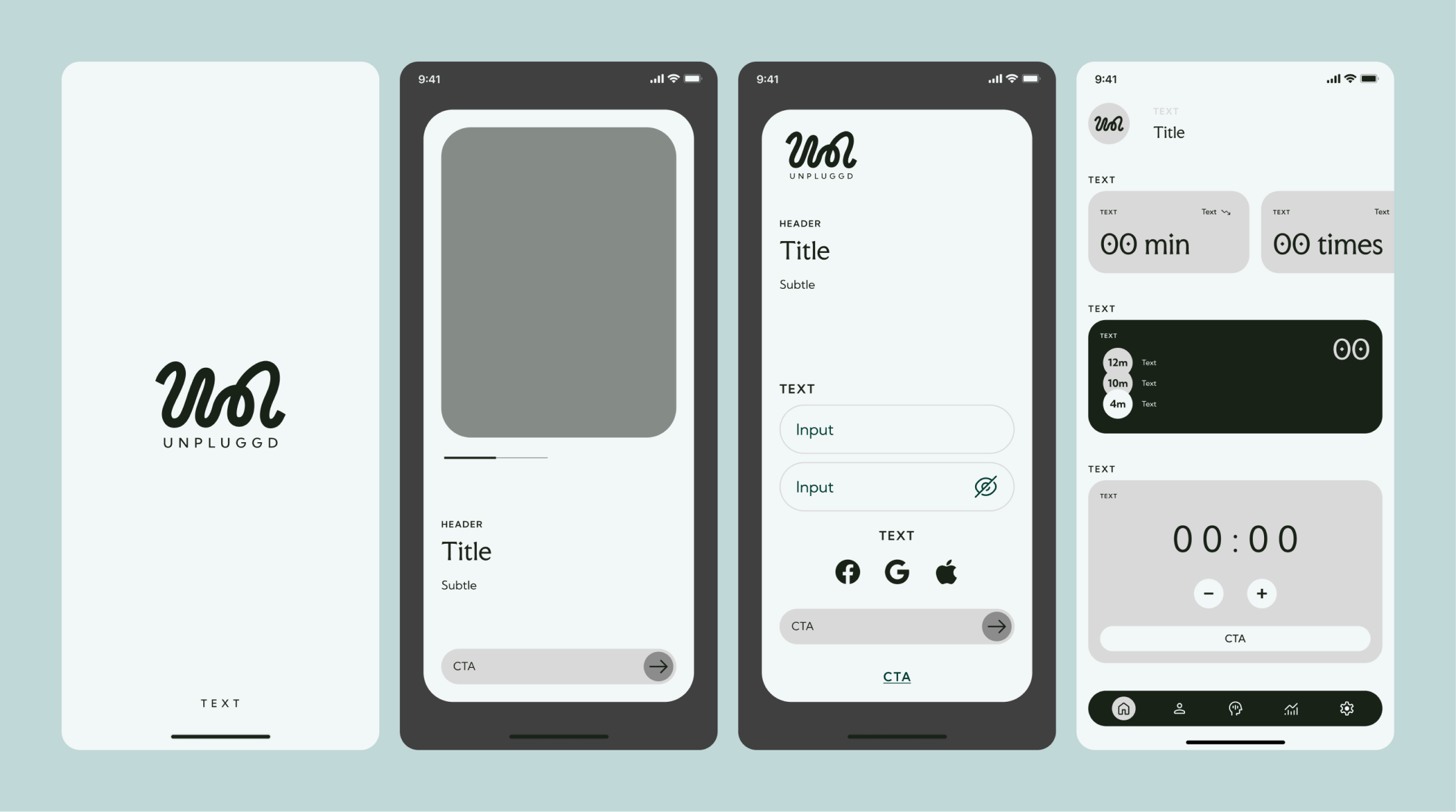
Onboarding introduces the product philosophy, then gathers enough context to shape the experience around the user’s goals.
Smart Screen Adjustments
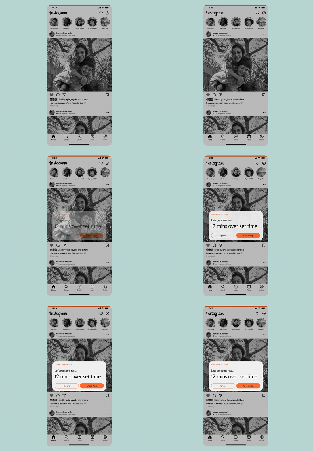
As screen use extends beyond a chosen threshold, the interface can gradually reduce visual stimulation through dimming and grayscale states.
The change acts as a quiet signal that time has passed without immediately blocking access.
Usage Insights
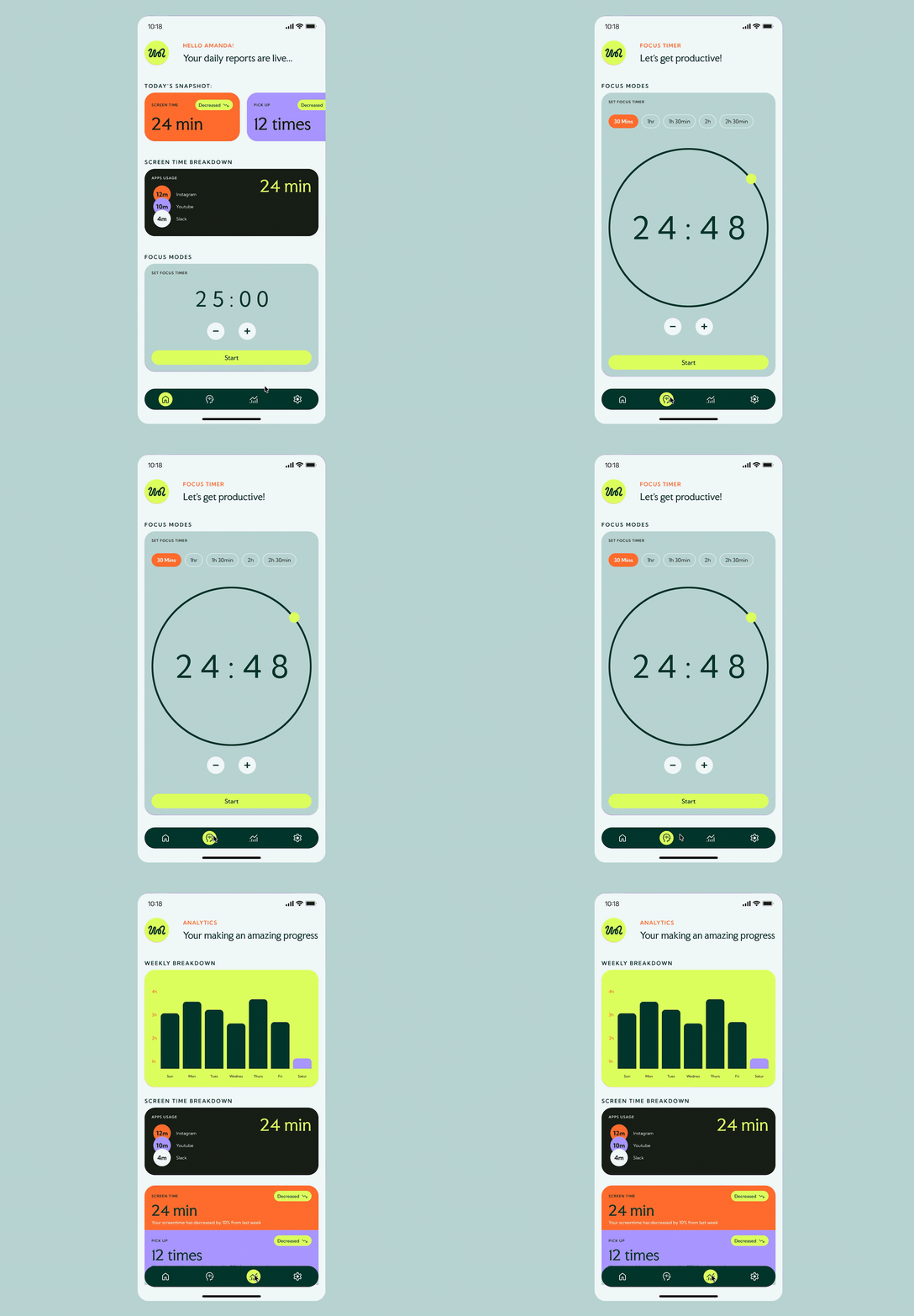
The dashboard brings daily and weekly usage patterns into one place so users can quickly understand how they are spending time across their device.
The interface prioritises simple summaries over dense analytics. Make the pattern visible before asking the user to change it.
Mindful Nudges
When a user crosses a chosen screen-time threshold, Unpluggd introduces a gentle prompt with clear options.
The nudge creates a moment to reconsider the current session while preserving user control. The intervention creates a pause. The user makes the decision.
Visual identity
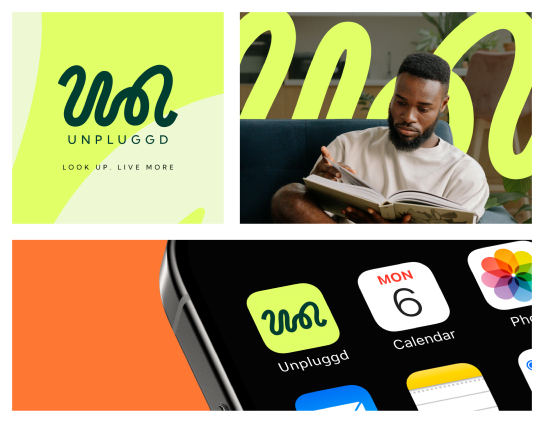
The Unpluggd identity uses a continuous flowing line as its central visual device.
The form references both the natural rhythm of movement and the cables associated with connected devices.
By turning that reference into a softer continuous curve, the identity supports the product's central tension: technology can remain part of life without controlling its rhythm.
Colour palette
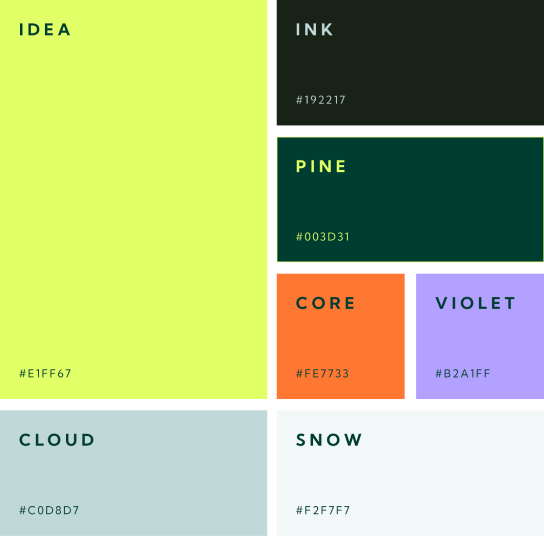
Vibrance with restraint.
The palette combines energetic accents with quieter supporting tones.
Typography
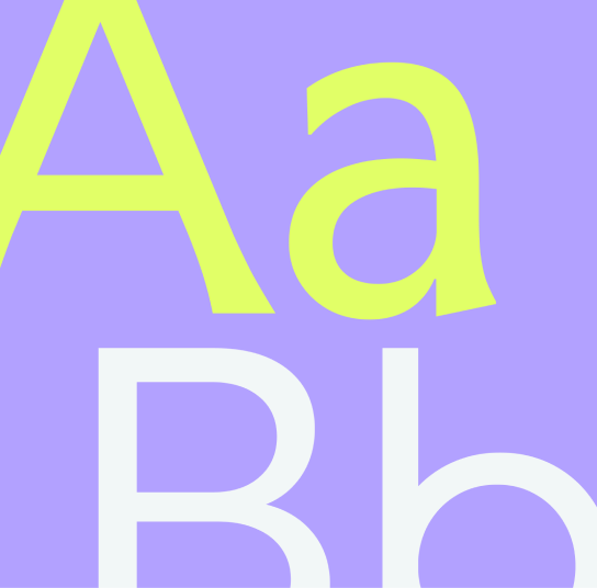
Faculty Glyphic + Kumbh Sans
The contrast gives the product enough character to feel distinct while keeping information-heavy screens readable. Faculty Glyphic and Kumbh Sans belong to the Unpluggd brand visuals. They do not replace the portfolio site's shared Project-page typography.
Project outcome
A 50-hour challenge developed into a complete product and UI concept.
Unpluggd was created within the constraints of the IFP 50 Hour Design Challenge, taking the project from problem framing through wireframes, interaction ideas, interface design, and visual identity.
Product direction
Reframed digital wellness around awareness and intentional choice rather than restriction.
Interaction system
Core features were designed to work as parts of one experience rather than isolated features.
Visual system
Identity and interface were developed as one connected product language.
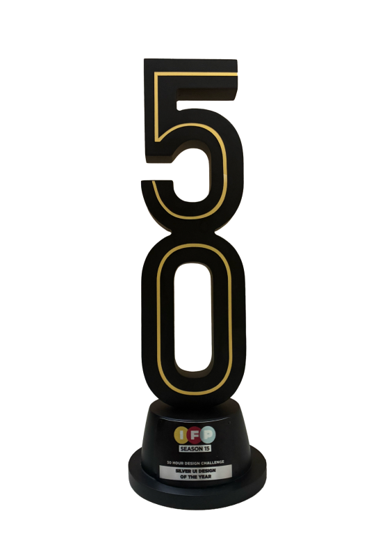
Recognition
Silver Winner - UI Design, IFP Challenge Season 15 2025.
Takeaway
Unpluggd explored how interface design can introduce that pause without removing the user's sense of control.
Digital wellness does not always need another hard stop. Sometimes the more useful design intervention is a well-timed moment of awareness.
Interactive prototype