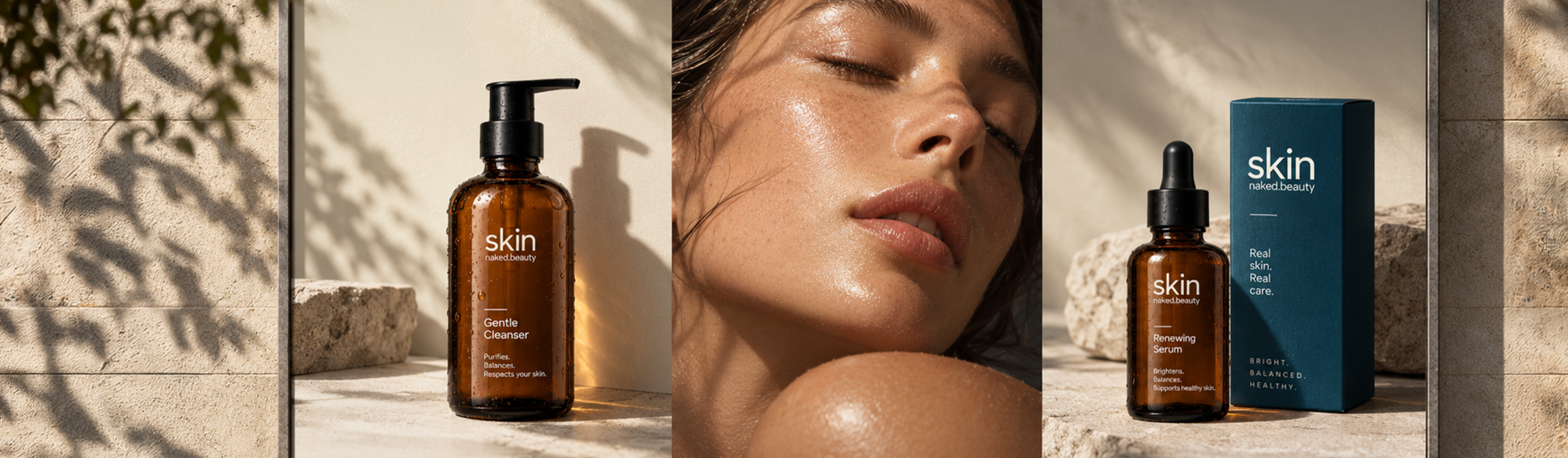
Skin | naked.beauty
A visual and digital identity for an elevated D2C skincare concept. Skin began as a UI exploration and expanded into a complete brand world across identity, packaging, imagery, and digital commerce.
- Contribution
- Visual identity, digital identity, packaging direction, UI design
- Team
- Independent project
- Date
- September 2024
- Status
- Completed concept
Context + problem
A skincare brand caught between two familiar extremes.
Clinical authority
Science, efficacy, precision
Prestige luxury
Exclusivity, polish, aspiration
How could Skin feel elevated and trustworthy without becoming either overly clinical or conventionally luxurious?
The understanding
Premium is not ornamental
Quality could come through restraint, composition, material, and product focus rather than decorative prestige cues.
Trust needed warmth
A purely clinical direction could communicate efficacy, but risked feeling impersonal.
Recognition that exists beyond logo
Because the brand needed to work across packaging, content, and interface, the system itself had to create recognition.
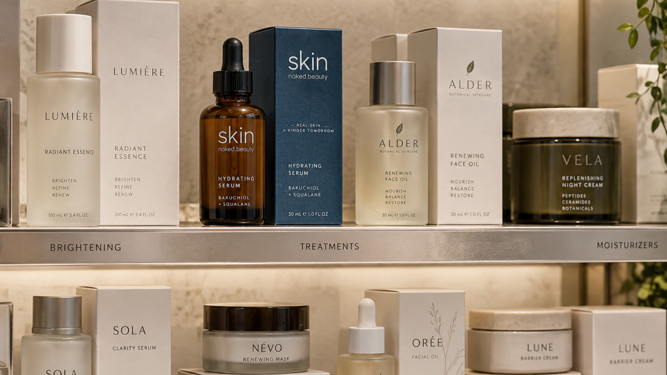
Make clarity itself feel premium.
The approach
Honest, uncomplicated skincare. Skin occupies a space between clinical credibility and traditional luxury.
Design principles
Clear
Products and information should be easy to understand.
Calm
The identity avoids unnecessary visual noise.
Real
The brand feels warm and approachable rather than overly perfected.
Design story
A system built through restraint.
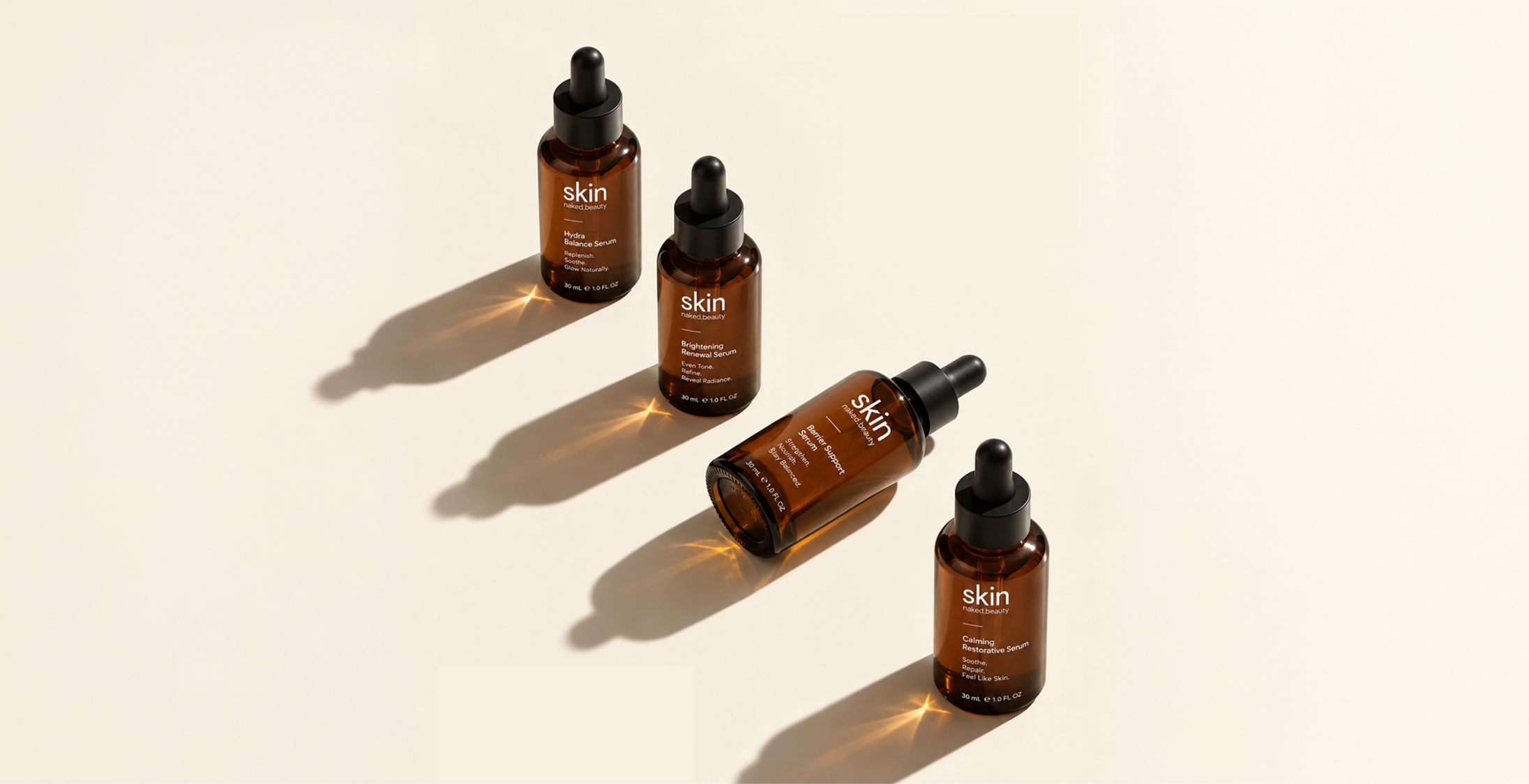
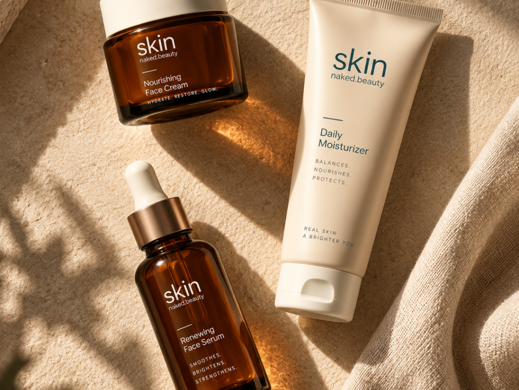
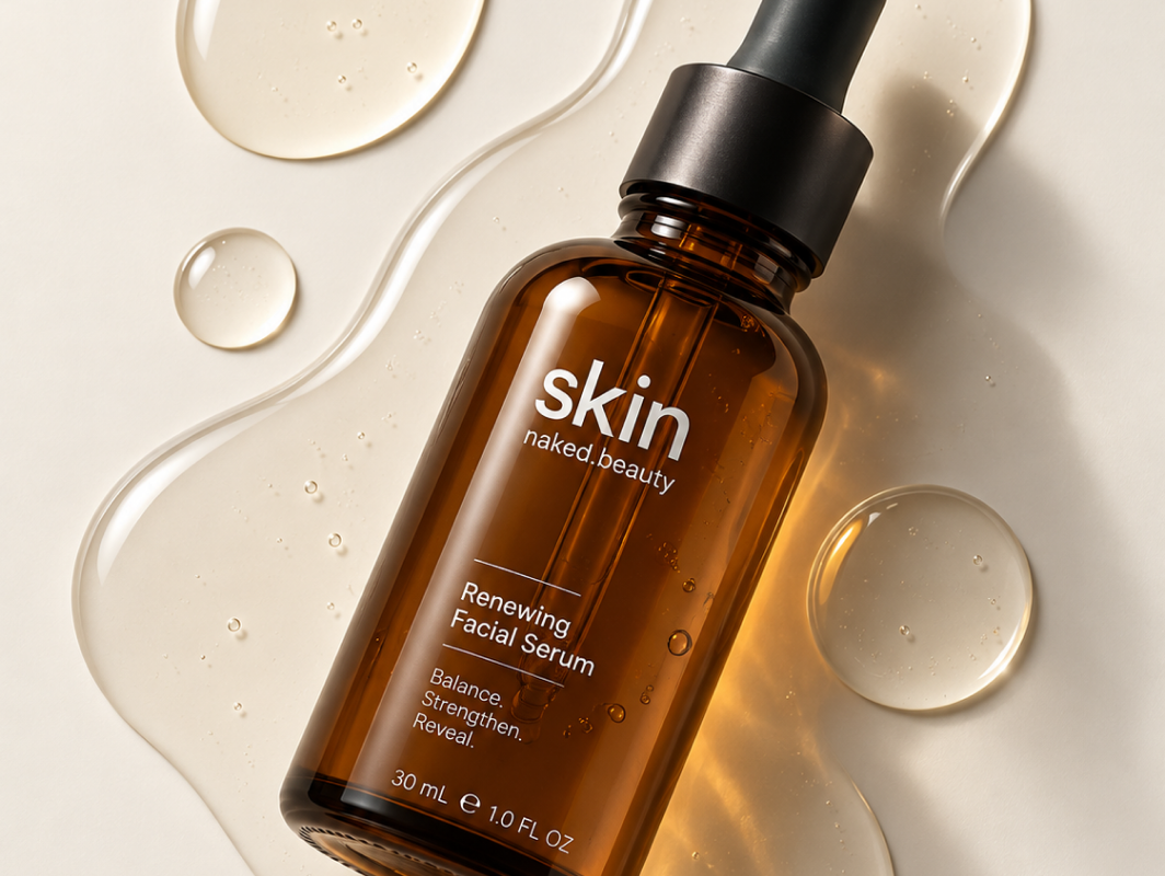
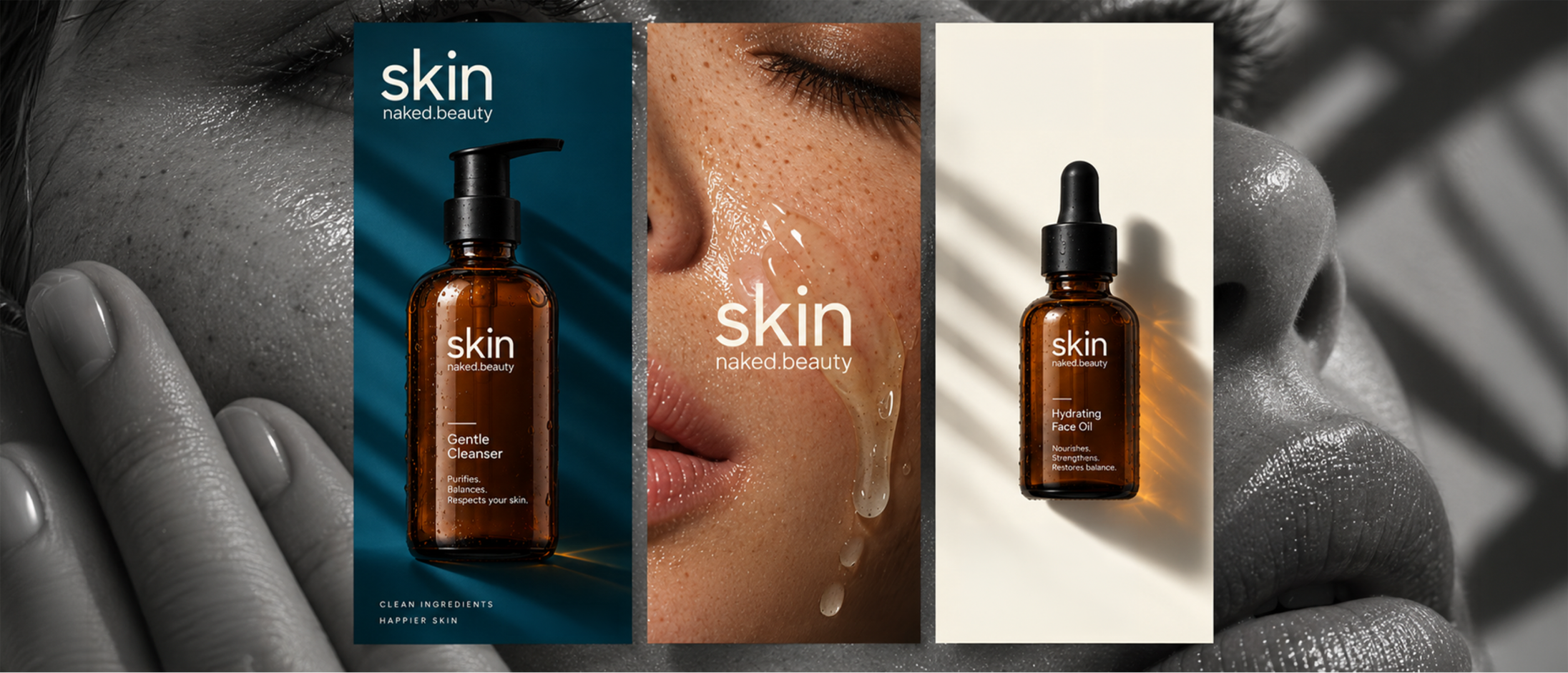
The visual language combines deep blue, warm off-white, amber material, restrained typography, and close product imagery.
Packaging became the first test of whether the identity could remain recognisable while staying restrained.
Repeated hierarchy, amber containers, and minimal labelling create continuity across the product family.
Identity
The wordmark stays deliberately simple so colour, hierarchy, imagery, and material can carry the brand’s personality.

Colour + material
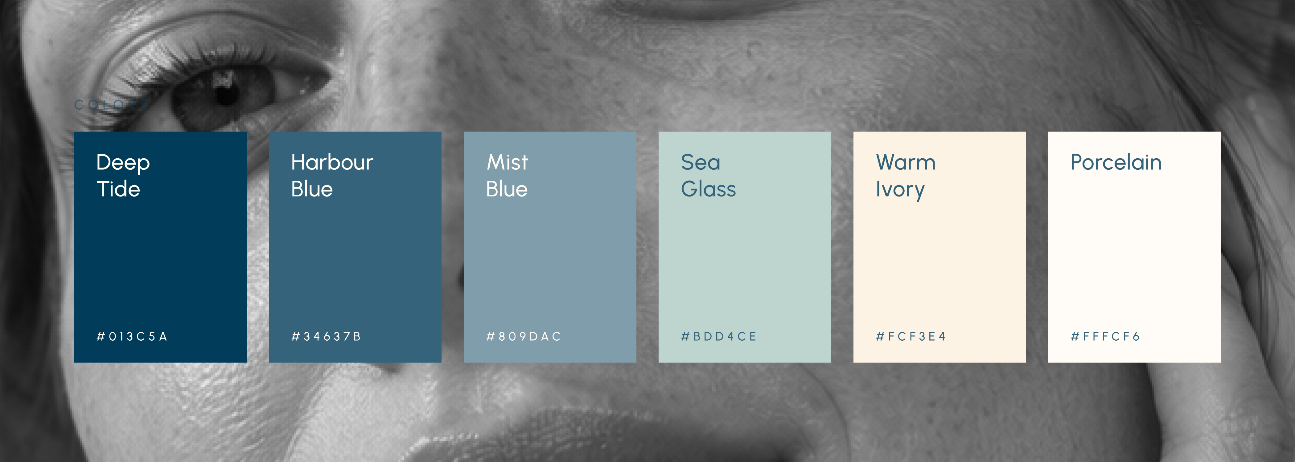
The palette balances credibility with warmth without relying on decorative luxury codes.
Deep blue
Trust and recognition
Warm off white
Softness and space
Amber
Material warmth and product character
From bottle to browser
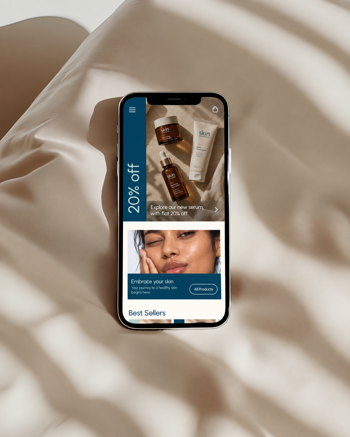
Rather than treating every screen as a separate composition, recurring components and hierarchy create consistency across the experience.
The digital interface carries the same principles as the physical identity:
Takeaway
A restrained brand only works when recognition is designed into the whole system, not left to the logo.
If developed further, I would strengthen the commerce UX, build more complete product-selection flows, and extend the packaging architecture across a larger product family.
Interactive prototype
Explore the digital experience
The prototype demonstrates the interface as an interaction concept. It has not yet been usability-tested or implemented as a live commerce product.View prototype ↗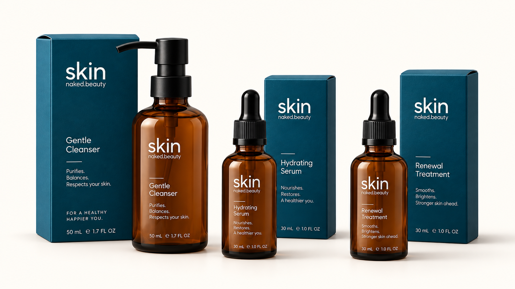



 UnPluggd