Bidura infra | The essence of living
A real-estate brand built around a decade of land-sourcing expertise and homes shaped around the people who will live in them.
- Contribution
- Naming, Brand Positioning & Strategy, identity design, visual direction, social media strategy, templates, brochure/catalogue, Canva system
- Team
- Divya Venkatesh + Bobby Pashine
- Date
- August 2025 - January 2026
- Status
- Brand system completed / rollout toolkit prepared
Project Over View
Bidura was built from the ground up as a new real-estate brand, from naming and positioning to identity, art direction, social strategy, and rollout tools.
At the heart of the business is a simple but distinctive model: Bidura does not begin with pre-built inventory. It begins with land. With 10 years of experience in sourcing land, the team identifies the right plots, connects them with the right clients, and then develops homes around what those clients actually need.
The brand therefore needed to express more than property ownership. It had to communicate the full journey from land → possibility → a home shaped around life.
Context & Challenge
The business was not selling a finished property. It was helping people begin with the right piece of land.
Bidura’s existing strength came from 10 years of land-sourcing experience, finding suitable plots, understanding their potential, connecting them with the right clients, and building according to what those clients wanted from their future home.
That made the business fundamentally different from a conventional developer selling a fixed catalogue of apartments, villas, or plotted projects. But without a clear brand story, that difference could easily disappear into familiar real-estate language around price, square footage, location, and inventory.
How could Bidura turn land sourcing and client-led building into a brand that speaks about life, not just property?
Category observation
The business was not selling a finished property. It was helping people begin with the right piece of land.
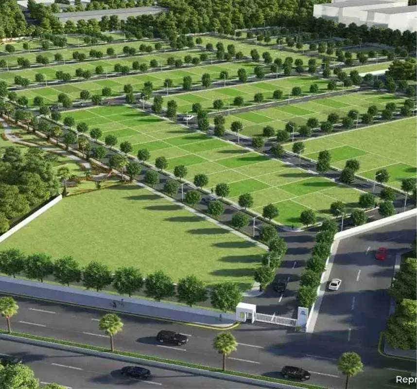
Bidura’s opportunity was to begin somewhere else: What can this land become for the person who chooses it?
Understanding
The land is the first design decision
The right home begins with the right ground beneath it.
client doesn’t pick a fixed product
The business needed to feel personal without becoming boutique or inaccessible.
A plot, the beginning of the value
The shift of brand story away from the plot as the final product and toward the life that can take shape from it.
Shift the story from owning land to shaping the life that can be built on it.
Rooted in Legacy
Rooted in Legacy
Legacy needed a future-facing expression. The name Bidura was developed as a stylised derivation of Bidurukota, carrying an existing family legacy into a shorter, clearer, more contemporary brand. The past gave the brand its foundation. The new identity gave it room to grow.

THE STRATEGIC IDEA
The Essence of Living
Bidura’s proposition is built around one distinction: land is not the end product, it is where a life begins.
The brand connects its experience in sourcing land with the ability to shape what comes next, positioning Bidura as a partner across the journey from finding the right plot to creating a home around the people who will live there.
Brand promise
Find the right ground. Shape the right home. Make space for the life that follows.
Positioning
Bidura makes thoughtful land and home-building decisions feel considered and personal without turning them into an exclusive luxury proposition.
Business proposition
The brand’s credibility comes from what it knows about land. Its emotional value comes from what that land can become for each client.
Voice
Clear & Informed, Warm & Human and aspirational without exaggeration
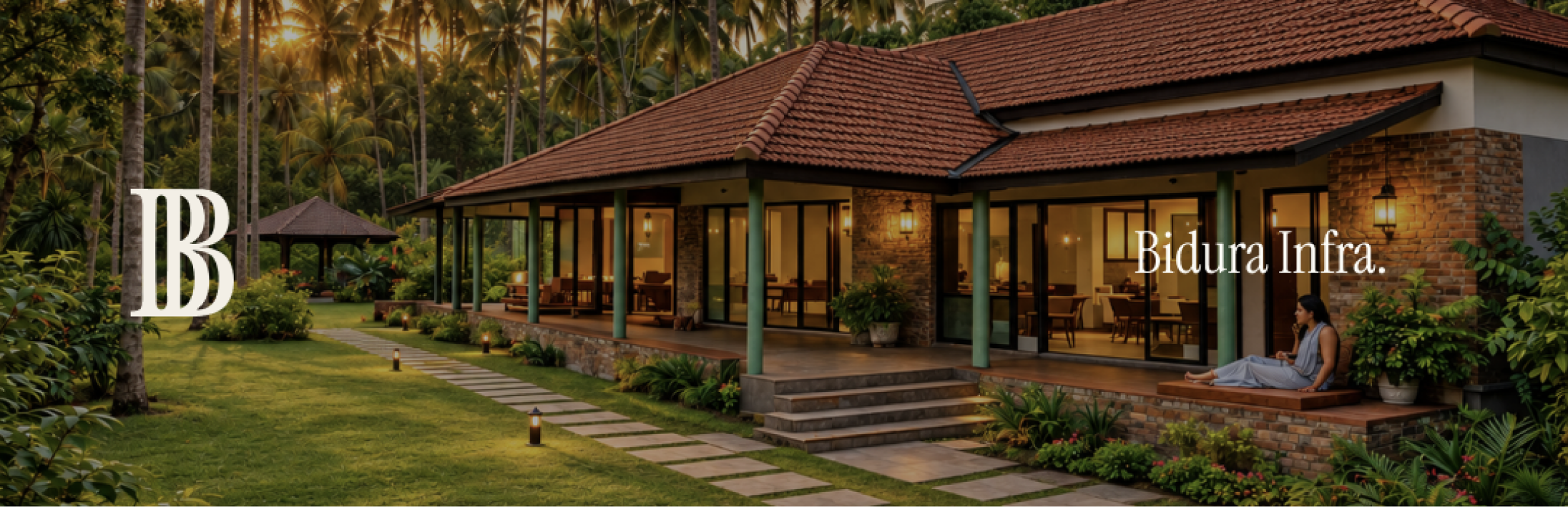
Design story
A new name built from an existing legacy.
The name was developed, retaining a sense of lineage and personal history while becoming shorter, cleaner, and more adaptable as a contemporary real-estate brand.
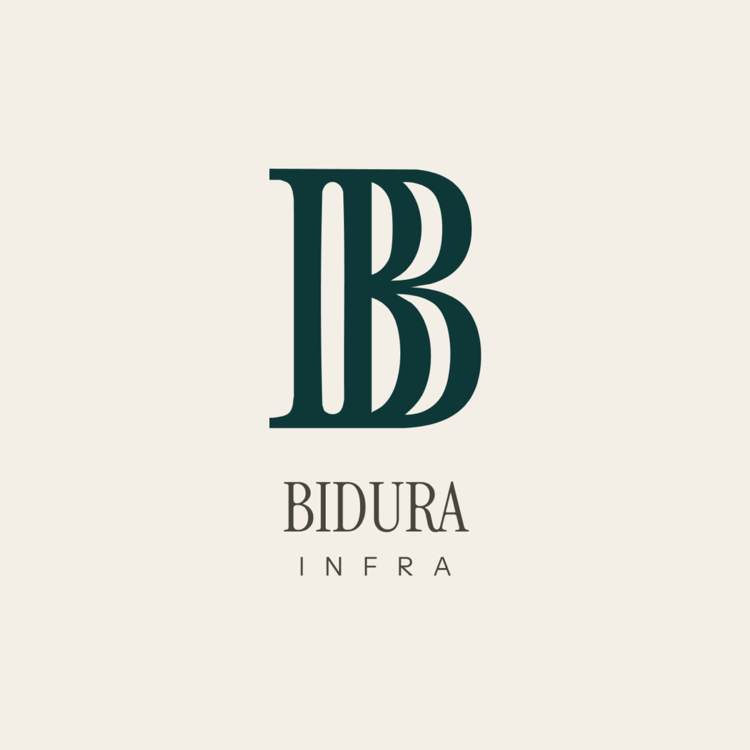
An emblem tied to legacy
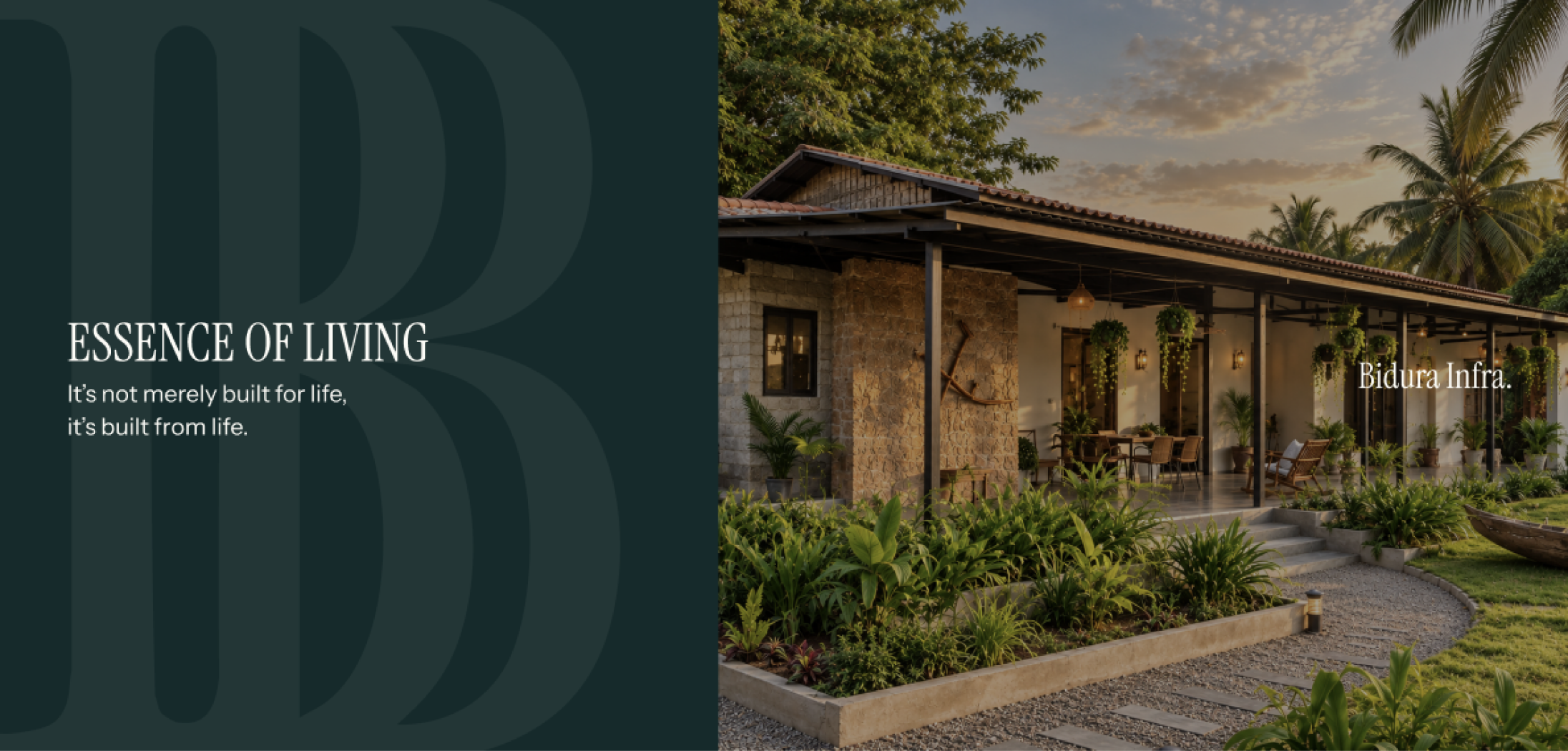
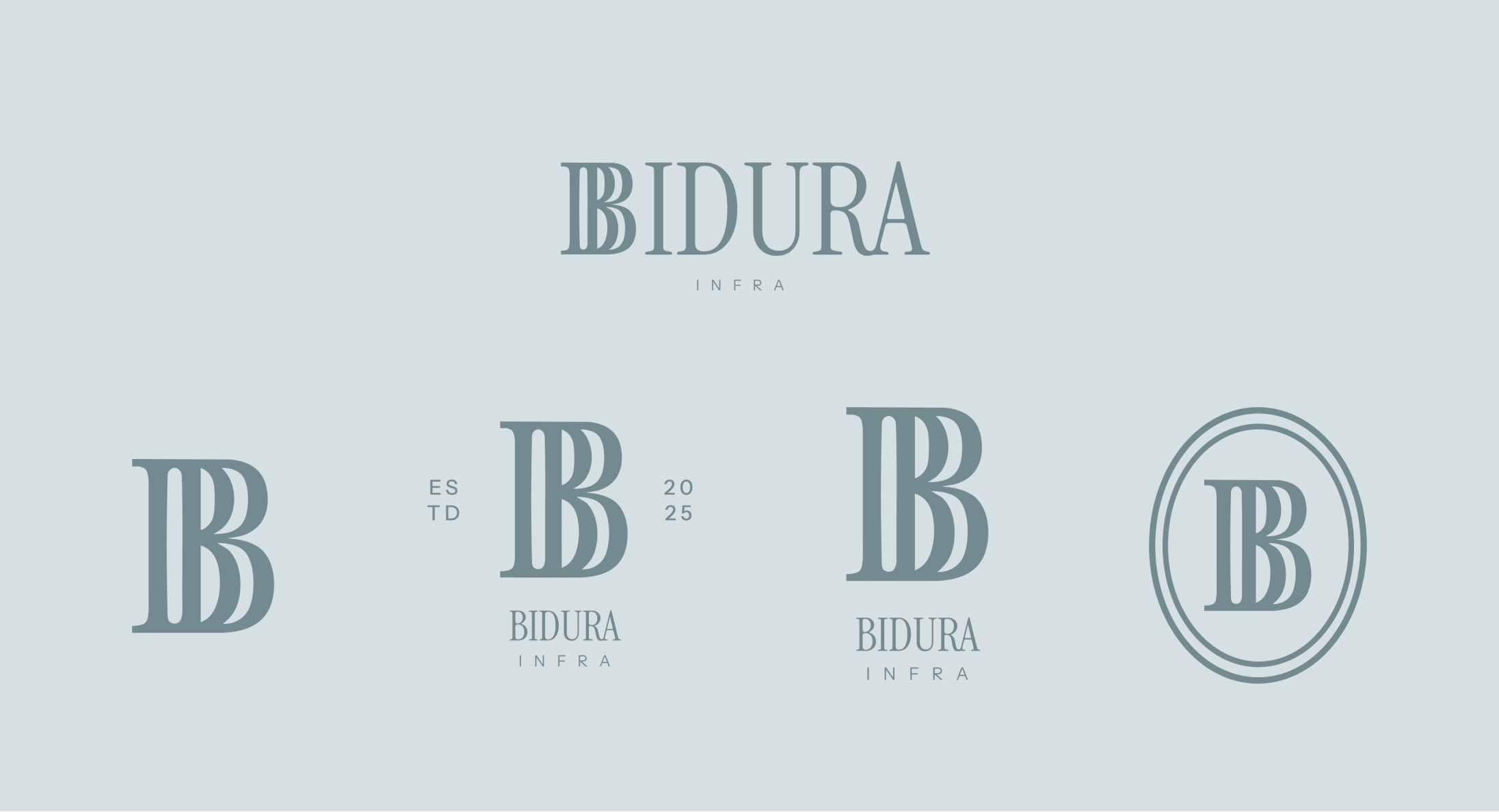
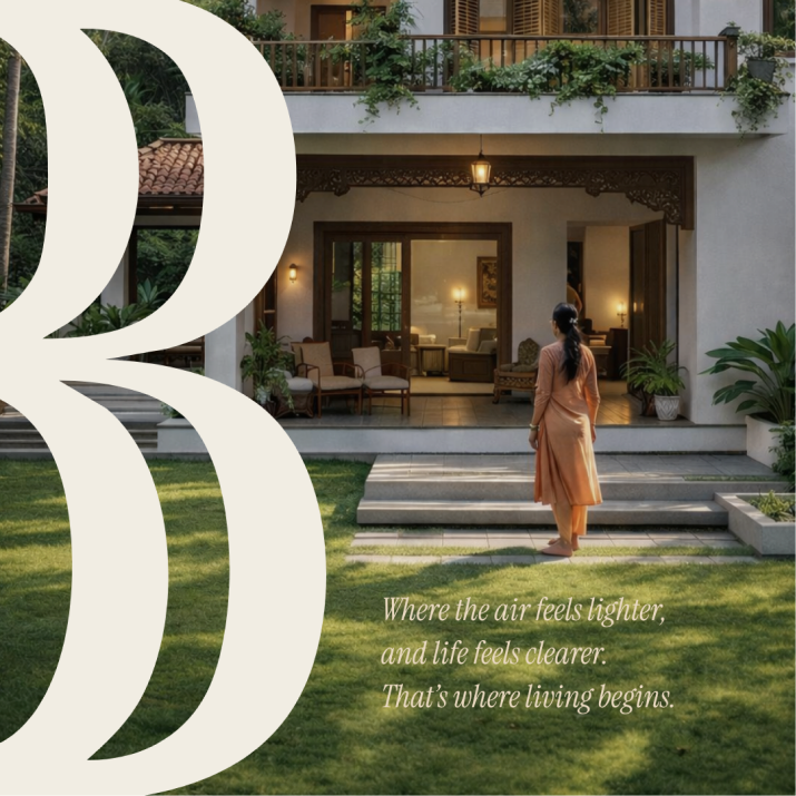
The identity is built around a distinctive B emblem designed to feel established, architectural, and premium without becoming ornamental.
Its vertical structure gives the mark a sense of permanence, while the letterform keeps the identity recognisable and compact.
Logo system
The identity was developed as a flexible system rather than a single lockup.
The system gives Bidura enough flexibility to move between land communication, residential development, social, print, and branded applications.
COLOUR palette
Grounded, not generic luxury
The palette keeps Bidura premium without relying on predictable black-and-gold real-estate cues.

Typography
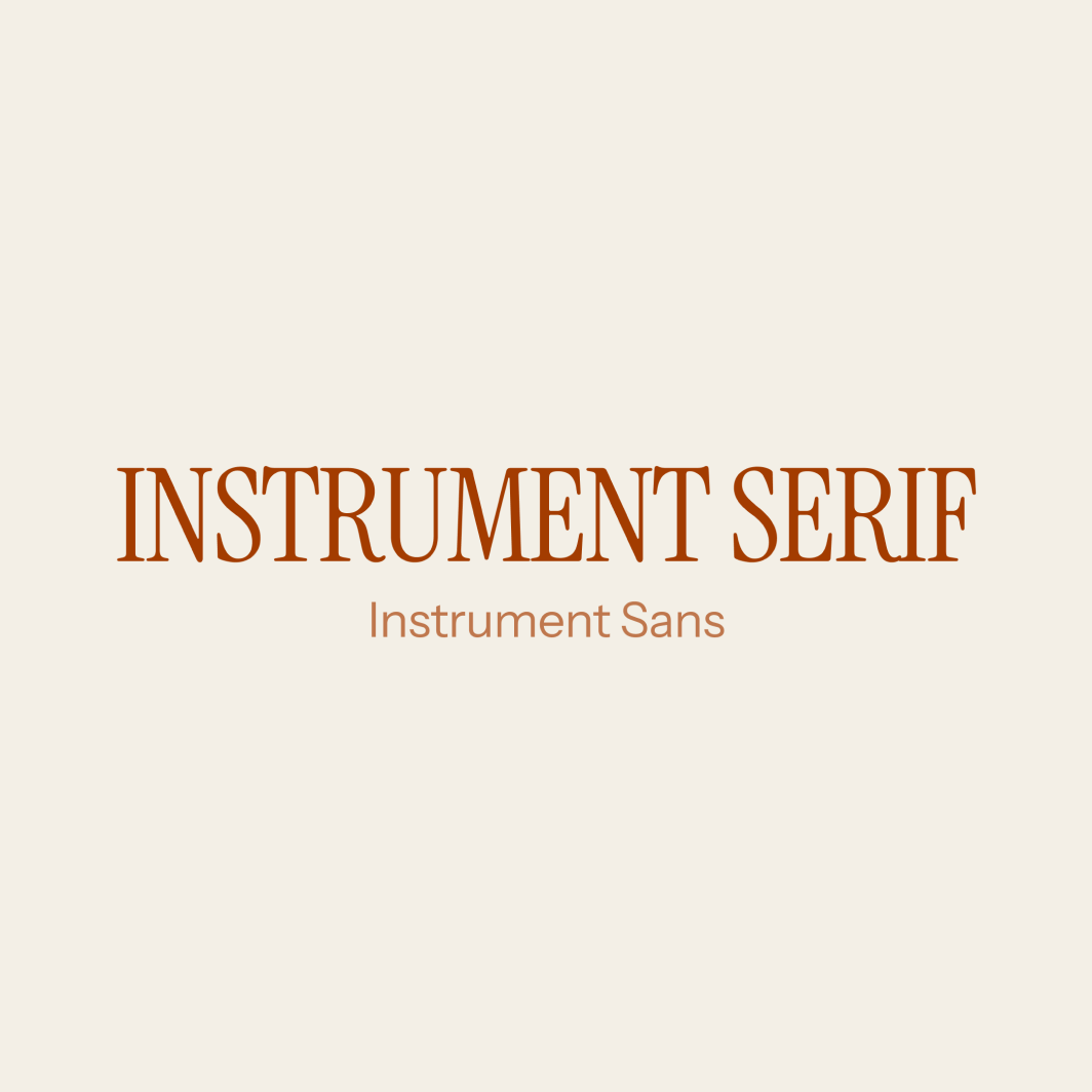
Together, they reflect Bidura’s balance of legacy + progress.
Instrument Serif brings heritage and warmth. Instrument Sans brings clarity and contemporary utility.
Social media strategy
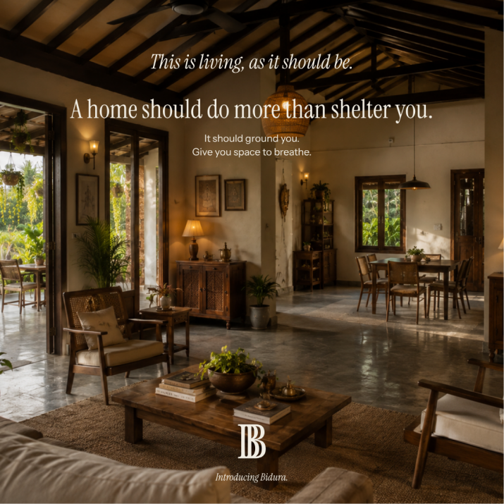
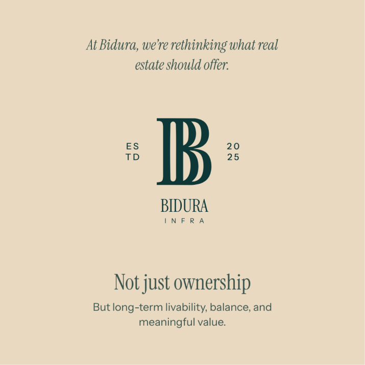
Social media was designed to communicate Bidura’s point of view beyond listings and sales-led real-estate content.
Bidura communicates with the confidence of knowing the land, and the restraint to let the life around it matter.
Content Pillars:
Takeaway
A plot is the beginning, not the product. The real value is what can be built from it, and the life that eventually grows around it.
Bidura reframed a decade of land expertise into a clearer brand proposition: Find the right ground, understand the person it is for, and shape what comes next around the way they want to live.